Micron Medical
Micron Medical is a medical device company involved in wirelessly powered, injectable neurostimulators. These are small devices implanted in the body that emit signals to help treat medical conditions. Patients participating in their clinical trial needed a mobile app to adjust their implanted medical devices.
The Problem
Patients with implanted medical devices for overactive bladder or chronic pain have trouble controlling their symptoms. They can’t fine-tune the frequency of their implanted medical devices.
My Role
UI design of the mobile app and Apple Watch app. My business analyst colleague devised the app's requirements.
Discovery
I learned about the company I was designing the apps for, the context of the design brief, and the patients that would be using the apps. Currently, the patients have no way of controlling the frequency and stimulation pattern of their implanted devices. Micron Medical would be needing a mobile app to allow patients to control their implanted medical devices. The frequency and stimulation of the device would dictate how frequently it stimulates the patient's nerves. This results in a stronger or weaker control of the patient's symptoms.
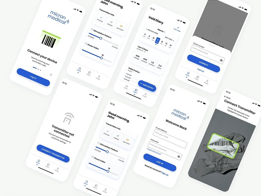
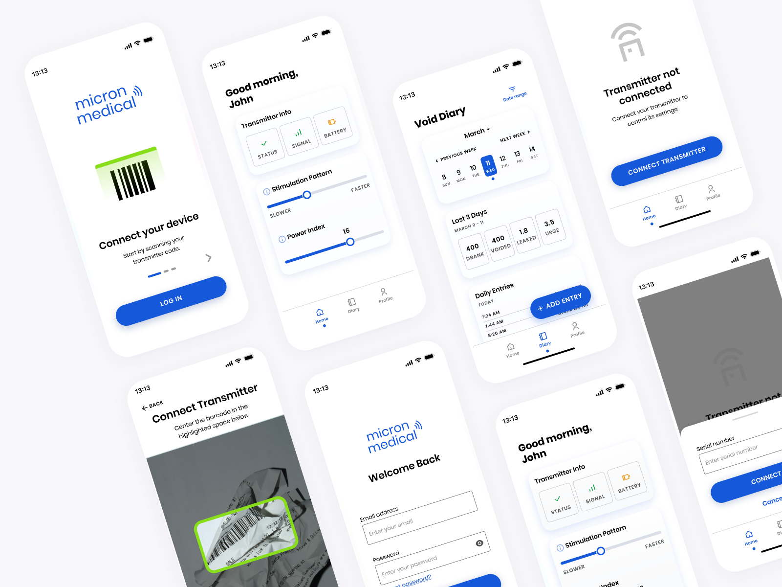
To get a better idea of the project's requirements, I reviewed the documentation provided by my company's business analysts. The mobile and watch apps would allow patients to connect to an external transmitter, which in turn allows the phone or watch to control the implanted medical device.
Many end users would be elderly, so I kept this in mind throughout the design process. It would be crucial to include supporting information wherever possible, to select a readable typeface, and to use high-contrast colors.
Design Process
Participants of the trial would need to use this app frequently throughout the day, so I wanted it to have a very minimal design, void of visual clutter.
Given that users may not know the meaning of several medical terms yet, I ensured there were information “i” icons located near the terms they correspond to. Upon clicking, there is a tooltip that explains the functionality.
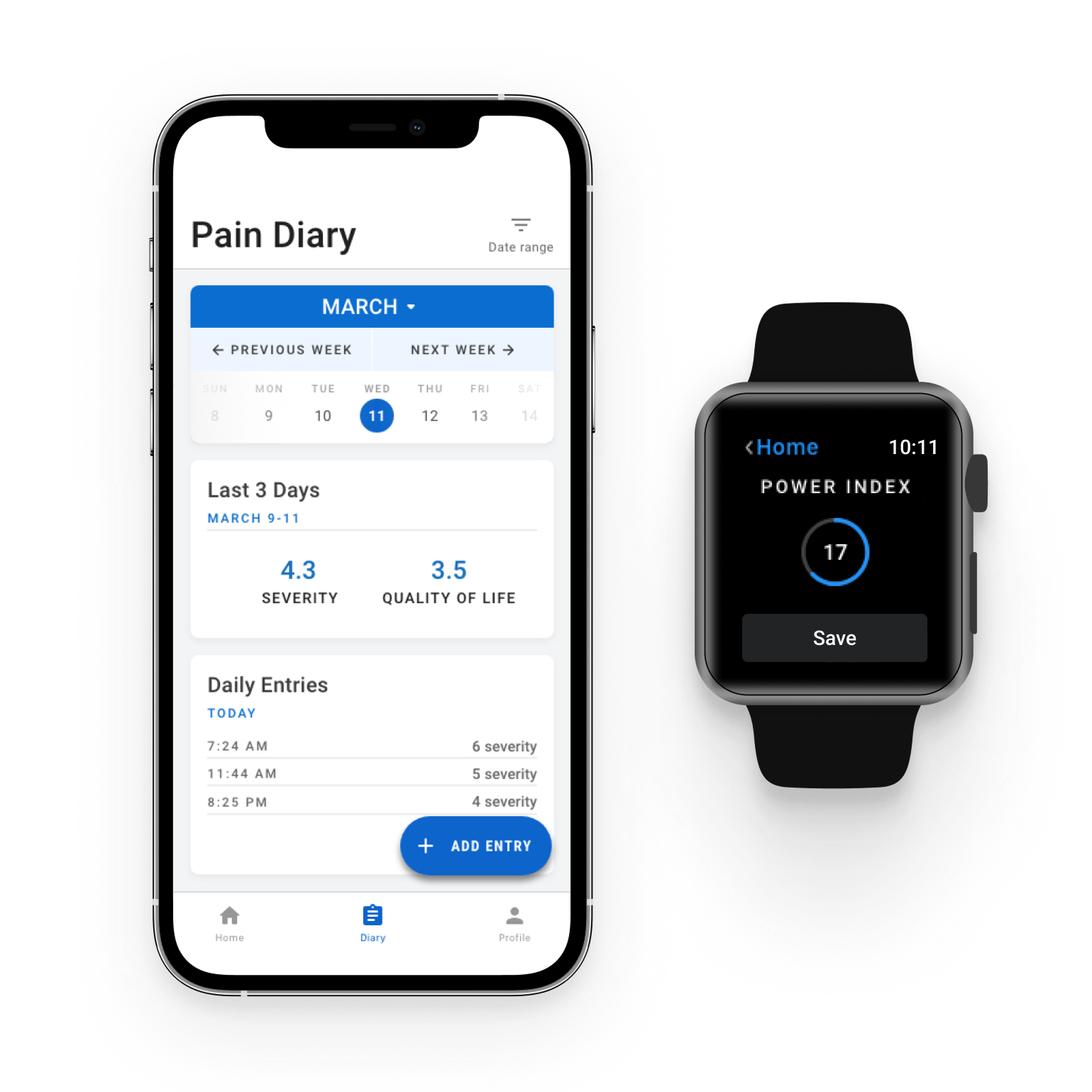
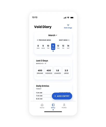
Designing the calendar for the diary tab was challenging for two reasons:
1. I wanted users to know they could adjust the weeks shown in the calendar, and
2. I wanted users to be able to switch months without having to repeatedly click "previous."
Apple Watch Screens
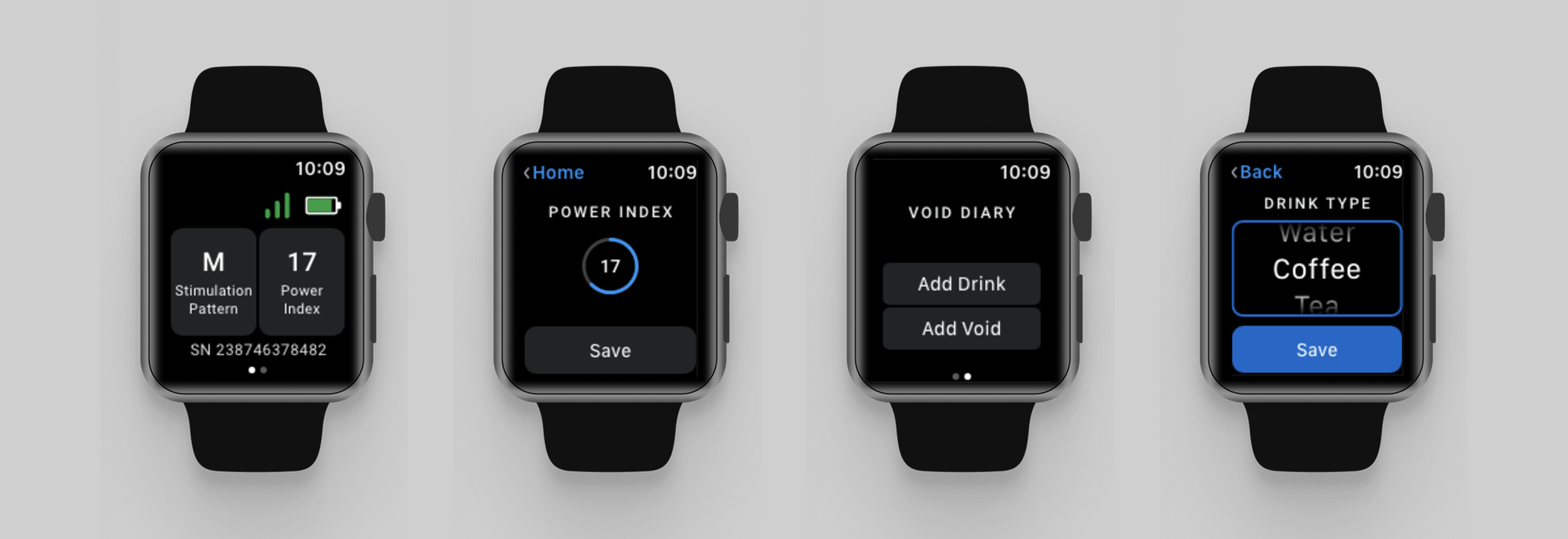
I designed the watch app using the official watch UI elements provided by Apple. I selected the smallest watch screen to design for. This way, I wouldn't need to worry about fitting design elements into a smaller screen later on (similar to benefits of the "mobile first" approach).
Although usability testing was not in the scope of this project, I had doubts about whether users would know how to adjust the power index, so I quickly sent a text to my friend who has an Apple Watch with an image of the power index screen. I asked what she would do in order to set the power index to 20. She said she would "scroll to change it to 20."
Conclusion
I designed the watch app using the official watch UI elements provided by Apple. I selected the smallest watch screen to design for. This way, I wouldn't need to worry about fitting design elements into a smaller screen later on (similar to benefits of the "mobile first" approach).
Although usability testing was not in the scope of this project, I had doubts about whether users would know how to adjust the power index, so I quickly sent a text to my friend who has an Apple Watch with an image of the power index screen. I asked what she would do in order to set the power index to 20. She said she would "scroll to change it to 20."